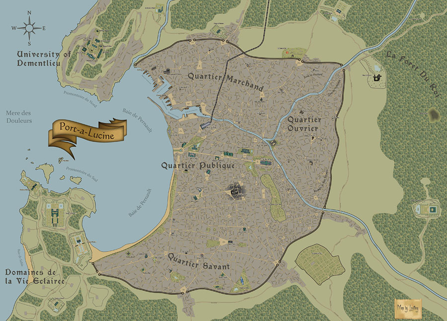
Cheers hope its useful!
Yep I am a member over at the cartographers guild, although for some reason I dont seem to post much (spend too much time here probabley). I really need to rememdy that.
Kage - please dont tempt me into writing a guide on mapping in Illustrator.

But here's some guidelines for anyone wanting to do somethign similar in a vector program (note these are all based on using Illustrator but should all be totally replicable in Freehand or Inkscape as well:
1.
Work in layers if you can, with something this size being able to isolate elements is invaluable (i.e select all the road names at once and change the font colour with one click). However before turning them into pdf’s or exporting its worth flattening the artwork into a single layer to reduce the file size. If you want I can post a version with the layers separated..
2.
The main technique I use for drawing streets is to find a suitable real life map, screen grab it, port it into illustrator, rotate it so its isn’t recognisable, lock the layer so it can’t move, then create a new layer on top. On this layer use the pen tool and simply draw connecting points for each road, remembering to de-select at the end of each street, so in effect you have a mass of separate lines (you’ll see why in a minute). For curved streets you need to use the convert anchor point tool and pull the anchors to get a bend.
Once you are happy with the layout of the lines, select all of them and stroke them in black to whatever pt size works for you. Then add a second stroke of a lighter colour but make the pt size 1-2pts smaller than the black. Alternatively you can make yourself some custom art brushes to replicate this then just apply them to your paths. Either way works… Incidently this is why you made a load of seperate paths , as when you apply a stroke it obviosuly thickens the path, and is you have oblique junctiosn that obliqueness gets magnified and you end up with lots of crazy sharp edges sticking out.
This will start to get there but look a bit disjointed, the secret is to create a compound path of all the lines, which you do by selecting all the paths then Object > Compound Path> make. This intersects all the paths and makes smooth joins, although you may need to go back and using the Direct Selection tool move the end points of paths if they overlap too much.
3.
The trees, boats and docks were all hand-drawn from scratch in illustrator and then because I knew I’d use a lot of them registered as a symbol and then placed in the map as instances. Effectively this means Illustrator is only using one tree graphic and replicating it from that (which cuts file size down massively- to use this you just drag and drop from the symbol pallette). This is a useful tip if you know you will use multiples of the same piece of artwork.
4.
The real key to making the maps work though is to get used to using the Pathfinder options, in particular add and subtract. What these do is allow you to add a shape to another shape area or take it away (you can then make the change permanent by hitting expand). I used this extensively to do things like the rivers, coastline, and the grey urban background to make sure they all matched up at the edges. This take some practice as at first it isn’t very intuitive and you’ll end up scratching your head about why certain things have happened, but stick with it as it’s the most time saving process I’ve found in illustrator for drawing complex shapes.
5.
The buildings are all based on real life buildings I found on Google maps or sketchup (some are more obvious than others, cookies are available for those able to identify them – although one of them is actually my house). In each case I ported the graphic into illustrator and traced them essentially using the pen tool. I created several gradient fills for the roofs etc. But really this was an easy process just time-consuming.
6.
The forest is a custom pattern I created using the tree symbols. To do this you create a square tile of any size you want. Then populate it with trees, it makes sense to use several different sized and shaped trees for the right look and space them randomly. The real trick here is to make the right edge line up with the left and the top line up with the bottom, that way you get seamless tiling. So fill with trees to close to the edge, then make a separate line of trees and place overlapping the top of your tile, on the bottom side place the same line of trees in exactly the same horizontal position, making sure whatever is outside the tile vertically on the top is within the tile on the bottom and vice versa. Rinse and repeat for the left and right sides. To then create the tile you simply draw a square that fits exactly to the size of the tile, make sure it’s the topmost object then select everything and hit the crop option in the pathfinder palette. This trims everything to the topmost shape and gives you a seamless pattern tile. Now drag this into the pattern pallet and you can use it to fill any shape or path.
7.
To create the text aligned to the roads I simply copied the whole road network layer and pasted on top in a new layer, and removed all the strokes and released the compound path. Then you take the Type on a path tool and add the names to your heart’s content.
8.
Finally the great thing about vectors is you can go back and using the direct selection tool move any single point you want to adjust and realign things. For example as I was adding road names I was tweaking the position of the roads themselves, changing the curve of the river slightly, re-sizing and amending buildings. It’s all fluid which is a joy after working in raster programs like Photoshop. Vectors are great for something like this where you have a lot of detail, of course its very difficult to replicate the graphical effects something like photoshop can perform, but thats the tradeoff for a crisp, clear map you can view at any scale.
If anyone is really interested I can supply some files or some screen grabs to illustrate the above.


 Overall I actually don't know (or want to know) but maybe about a 100 hours.